
Through pure magic, you can now adjust just 4 colors to make the rest of your Userflow theme look pretty.
Using the 4 new Brand/Main Background/Text color options, we automagically calculate suitable hover and active colors and apply those colors to all elements such as buttons, inputs and progress bars.
For example, pick a nice purple color for your Brand Background color and you get this:
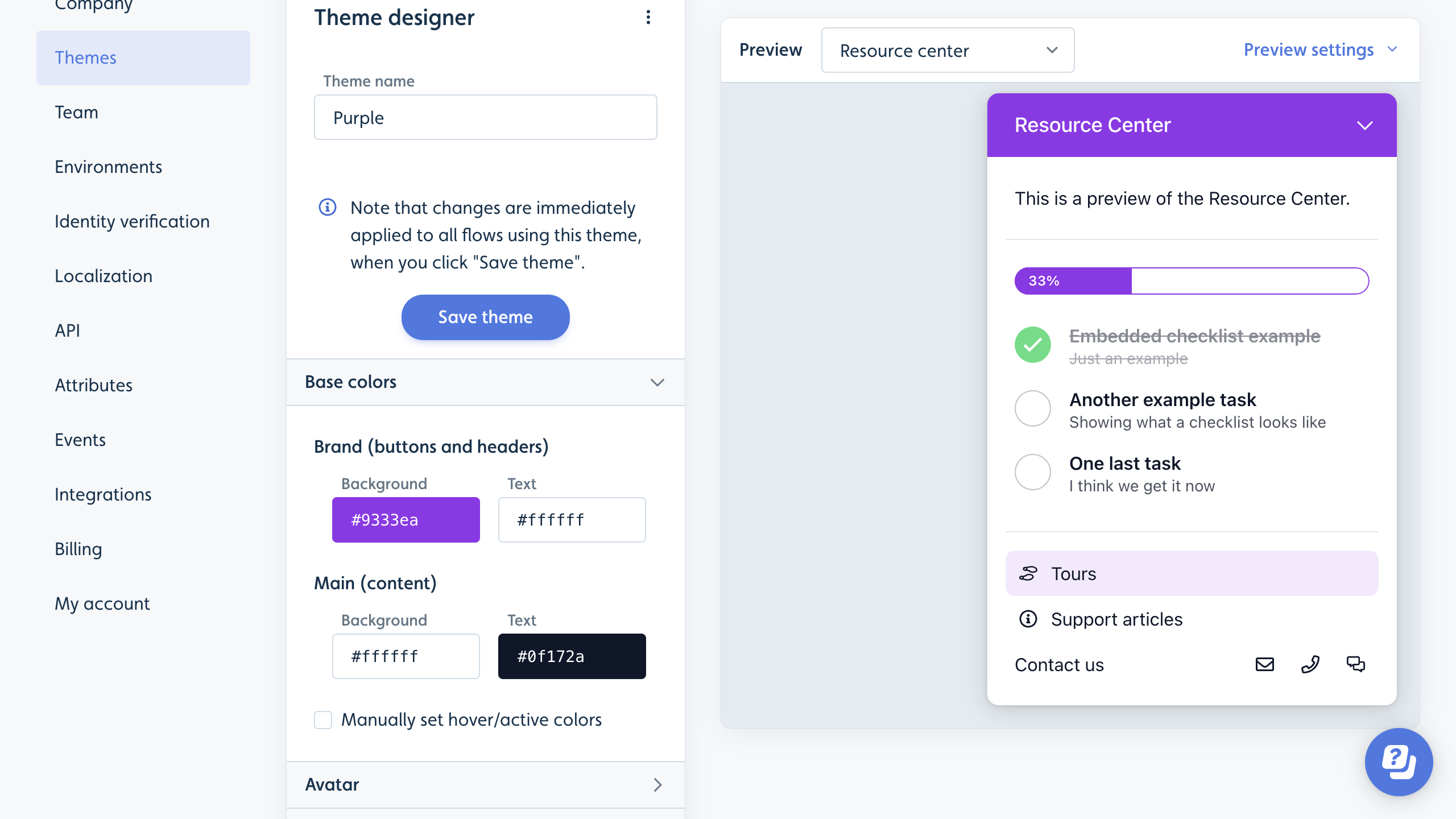
Oooops! That was a spoiler about our upcoming Resource Center - sooo sorry to reveal that! (Psssst reach out to us for early access).
We've also introduced 2 new standard themes: Standard Light and Standard Dark.
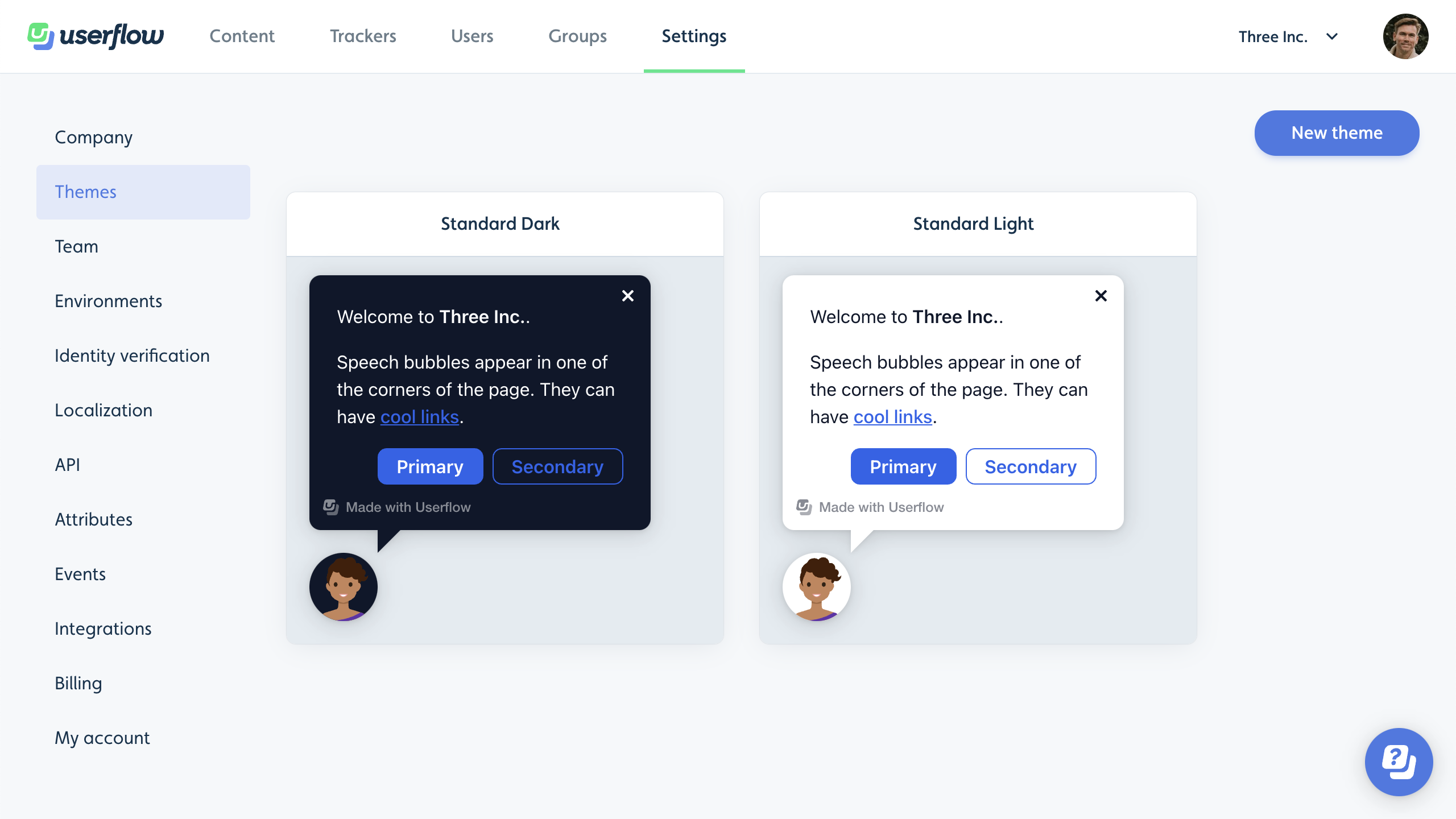
The new themes use the popular Tailwind CSS color palette (which is also what we use in the color picker now). We've also switched to the "system font stack", making the font match your user's system font.
The old themes have been renamed to Standard Light 2019 and Standard Dark 2019, and are only visible for companies that registered before today.
Another tiny change is that the button appearance previously called "Default" is now called "Secondary". So you have Primary and Secondary buttons. New buttons default to being Primary.

%20copy%2012.png)
%20(1)%20copy.png)