

We've released some improvements to our flow beacons. Beacons are used to draw users' attention to specific elements, so it's crucial that they're highly visible, yet not intrusive.
The beacon animation is now two expanding rings. They expand over 2 seconds, 1 second apart, making it look like ripples. Here's a GIF:

We stuck to a yellow color. I believe that red is too intrusive (you don't want to welcome your new users with a bunch of error-like red). We're now using Material Design's Amber color (500), which is a reasonable default color since it increases the likelihood that it's somewhat familiar to the user. This color will obviously be customizable very soon so that you can pick your own color (holla at me if you'd like this before it's generally available).
Beacons now follow content around precisely and immediately. Before, they would either jump periodically or not move at all.
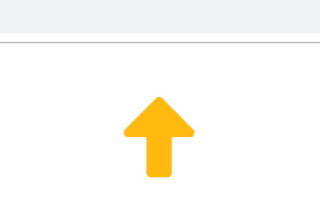
Beacons are automatically hidden if they're scrolled out of view (it even works with nested scroll containers). If they're outside of the browser's viewport, an arrow will point in its direction, so the user knows where to scroll to:
Performance has also been improved, which could make a difference to users on very low-end devices with multiple beacons.
The changes also prepare us for the upcoming "highlighted areas" (WIP term). Instead of a pulsating dot, you'll be able to highlight a whole element on the page with a rectangle around it. Optionally, you can also choose to mask everything around it, so the user can't click there. Stay tuned!
About the author


