

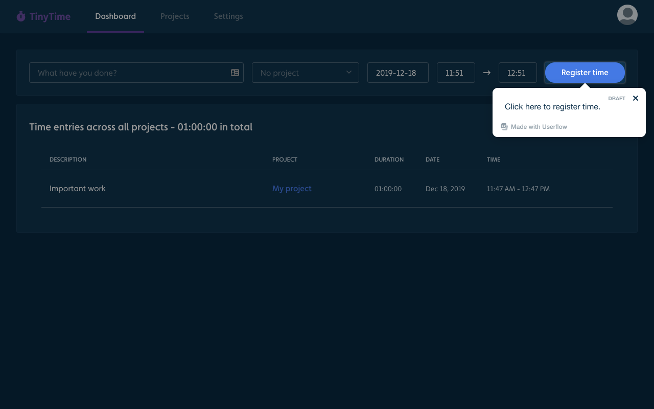
When you build flows with Modal steps or use the Backdrop feature of tooltip steps, Userflow will add a semi-transparent layer on top of your app to give extra focus to the Userflow element.
By default this layer is 40% opaque black. This works well on light UIs (since it makes your own app's UI look grayed out). It does not work well on top of very dark UIs (it just makes things slightly more dark).
Here's an example of a dar-mode app with the default backdrop (#000 at 40% opacity). See how the focused element barely stands out:
You can now change both the backdrop color and opacity under Settings -> Themes. Scroll down to the Backdrop section. Choose Modal in the Preview drop-down field to see a preview of it. Opacity is a percentage number between 0% (completely transparent) and 100% (completely opaque).
For apps with dark UI, we suggest using either a light backdrop color with low opacity (e.g. 25-50%), or a dark color with high opacity (>50%).
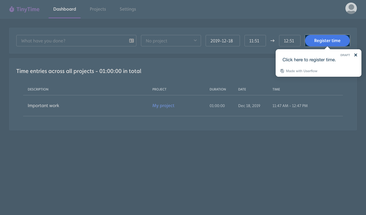
Here is the same app from above with a black backdrop color at 65% opacity. The contrast between the background content and the focused element is a lot better!
Here it is with #aaa (light gray) at 40%:
About the author


