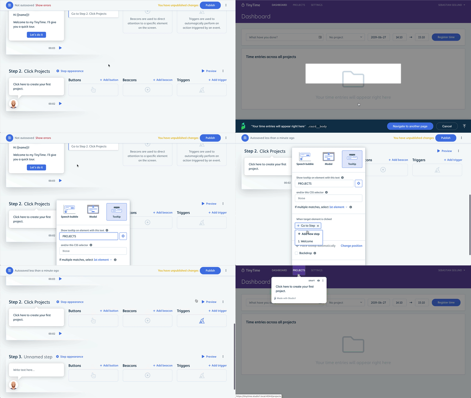
You can now add tooltips anchored to specific elements in your web app. Tooltips are great if a flow step asks the user to click a specific element on the page.
Choose Tooltip in the Step appearance popover next to a step. Then select the element you want the tooltip to be anchored to. Optionally add an action or enable backdrop.

Tooltips join our 2 other step appearances: Speech bubbles and modals.
Tooltips feature highlights:
- Tooltips are automatically scrolled into view.
- Perform actions, such as going to the next step, when users click the target element.
- Optional backdrop, which adds a semi-transparent layer on top of your app, revealing only the target element and the tooltip.
- Tooltips are automatically placed either above, below, to the right of or to the left of the element - depending on what seems best for the user. You can optionally set your desired placement.
CONTENTS


.png)
.png)
%20(2).png)


